In Category on 24 Jun 2026
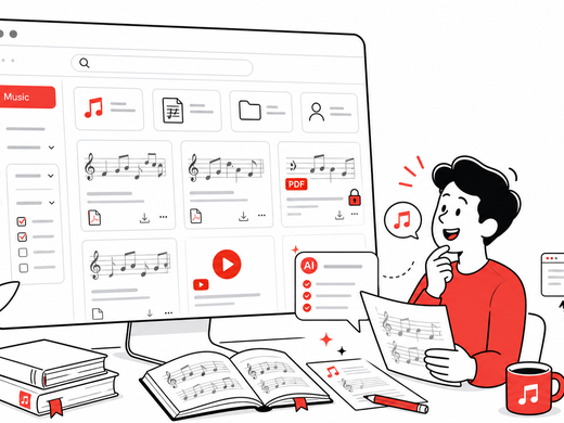
The Most Unexpected CKAN Use Case I've Ever Seen: A Sheet Music Directory With AI Metadata
Wolfgang from Ondics built an open source sheet music catalog on CKAN — with AI metadata generation, YouTube playback, and cross-instance sharing. Here's how.