We are thrilled to share the results of our recent survey on the new color for the CKAN out-of-the-box interface. Your enthusiastic participation has been incredible, and we appreciate every vote and piece of feedback we received.
Gathering Community Input
In total, 70 people participated in the survey. While this number may not be statistically significant, it provides valuable insights into our community's preferences. Gathering input like this helps us understand what our users think and guide our design decisions.
And the Winner Is...
Royal blue!

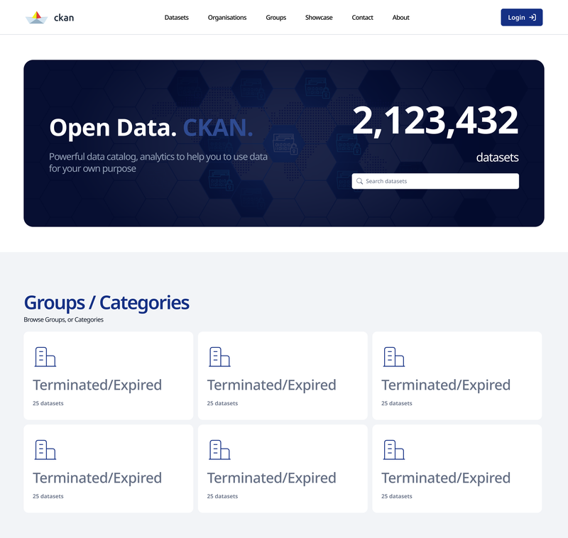
Yes, you voted, and royal blue has emerged as the clear favorite among the six color variations we presented. You can see the six color variations here.
Survey Results
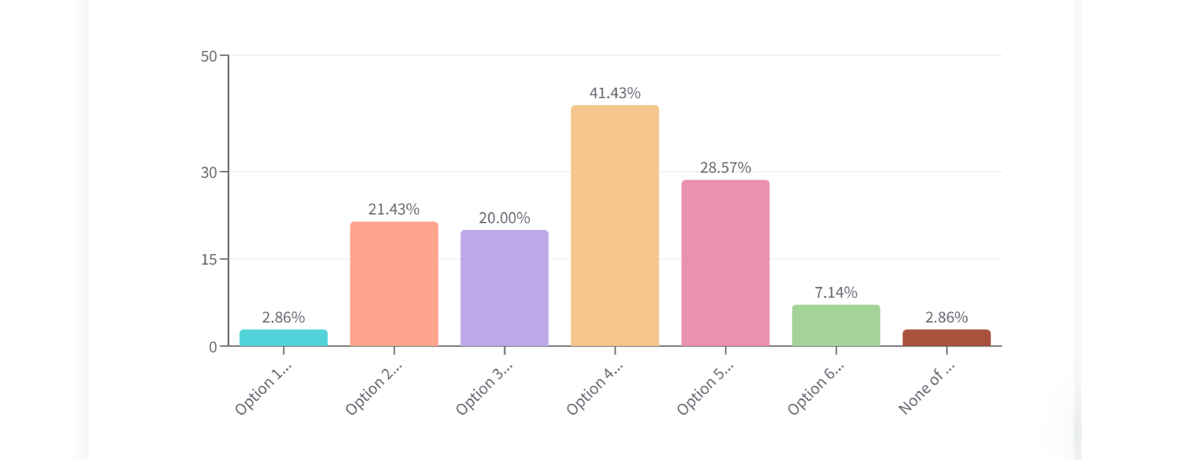
Here is a visual representation of the survey results. The detailed percentages are:
- Option 1: Red - 2.86%
- Option 2: Cyan - 21.43%
- Option 3: Grey - 20.00%
- Option 4: Royal Blue - 41.43%
- Option 5: Teal - 28.57%
- Option 6: Volcano - 7.14%
- None of the above - 2.86%
What's the Psychology of Royal Blue?
Royal blue stands out for several compelling reasons:
- Professional and trustworthy - royal blue is often associated with professionalism, trust, and reliability, making it an ideal choice for a data management platform like CKAN.
- Visual appeal - the rich, deep tones of Royal blue provide a striking yet sophisticated look that enhances the user experience without being overwhelming.
- Enhanced Readability - the high contrast of Royal blue against various backgrounds improves readability and usability, ensuring that important information is easily accessible.
Customization Made Easy
We understand that preferences vary, and while Royal blue was the top pick by our community followed by teal, customization is key. Thanks to Petar, our talented UI designer, we've made it incredibly simple to customize the color scheme. Petar has programmed variables in Figma, allowing you to change the color without additional effort. It takes just 5-10 minutes to switch to any other color from the list or one that suits your preferences. This flexibility ensures that you can tailor the CKAN UI to fit your brand or personal taste with ease.
Additional Comments and Suggestions
We also asked if people had any additional comments, suggestions, or feedback. Here are some of the insightful responses we received:
- Tooltip Integration: "It would be useful to have tooltips or help icons next to new features to help users understand their functionality quickly."
- Feedback Button: "Integrating a feedback button within the UI for ongoing suggestions and bug reports could be beneficial."
- Dashboard Flexibility: "Can we have more flexibility with the dashboard layout? Being able to rearrange widgets and sections would greatly enhance user experience."
- Dark Mode: "Consider adding a dark mode. It’s easier on the eyes, especially for those of us who work late into the night."
- Personal Testimonials: "Hello, my name is Omar and I live in Senegal. Ever since I discovered CKAN I've become more and more enthusiastic about the idea of becoming a Data Driven and Open Data specialist. I encourage the whole team behind the work to offer us a seamless experience."
- CSS Variables: "Why choose one? With CSS variables, we should be able to ship each of these and change between them with a single CKAN config setting, where a name chooses the color palette? I suggest this because they all look decent."
- Minimalistic Design: "I think its color should be minimal / not too bright etc. I would go with grey scale."
- Modern Colors: "We don't want any color looking like there is a thread coming (ie red and orange etc.). The usual blue is quite outdated and old school. We need more modern colors such as this turquoise blue."
- Highlighting CKAN: "In Option 4: Royal Blue, the background color is nice but CKAN is not highlighted/visible that much. So, if we can do something to enhance that it would be great."
- Teal Preference: "I like the CKAN teal (:."It would
- Just a nice comment: "We❤️U"
Thank You for Your Participation!
The CKAN community's engagement is what drives our continuous improvement and innovation.
Stay tuned for the official rollout of the new UI. We will keep you updated through our blog and social media channels. Your feedback is always welcome as we make this transition.
Thank you for being a part of the CKAN community and for helping us shape the future of open-source data management!


